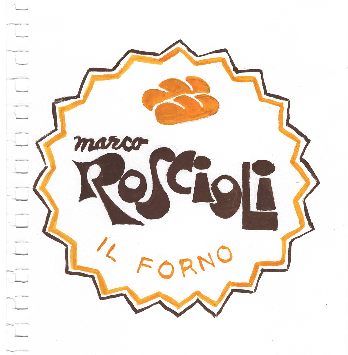
this is the logo from my favorite bakery. it was one of the first things i copied when we arrived. i was (am) in love with the funky, chunky type and the bread is the best.
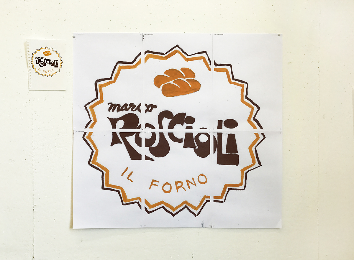
i scanned in my drawing and printed it big to play with scale in the copying. david thinks this oddly just celebrates a bourgeois bakery. i'm not sure how I feel -- i left in the page tiling and crop marks as evidence of the scaling and printing. i think it muddies the project if i continue down this path and start getting creative in the copying by changing the scale, or cropping, or repurposing.
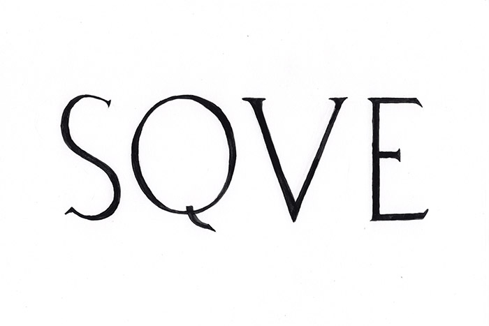
this is a copy of the sign from a local alimentari in trastevere.
and this is from a meat shop near the pantheon. all the meat stores have marble interiors and this one especially looks like a candy store on the interior.
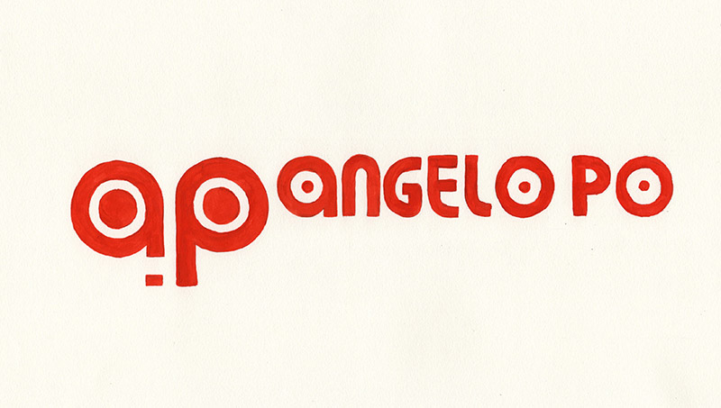
this is the logo on a campervan parked nearby the academy. i think you might see a pattern here for the typography i love -- chunky, quirky and oddly spaced.
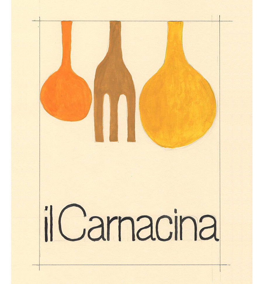
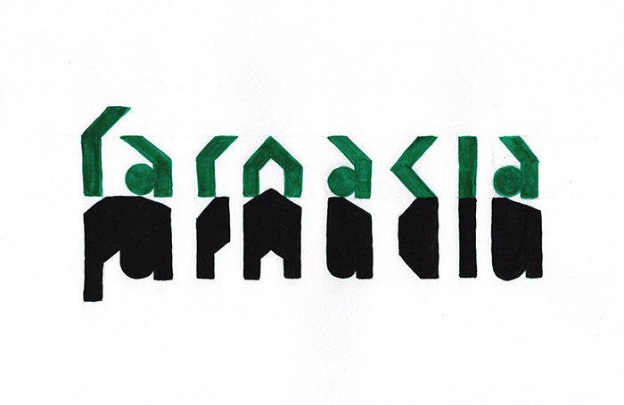
copy of a cookbook cover from 1972 that i found in a used book store on my birthday. the day was bright and sunny and i was charmed by everything i saw. Carnacina is not a 'meat kitchen' as i kinda thought at first -- he was a famous italian chef.
there is no fear of backwards type on signs here. obviously, the sign is perpendicular to the store and can only face one way on the street. i think that people are more hung up about backwards type in the US -- but it is no big deal, you can figure it out! plus it looks so great...
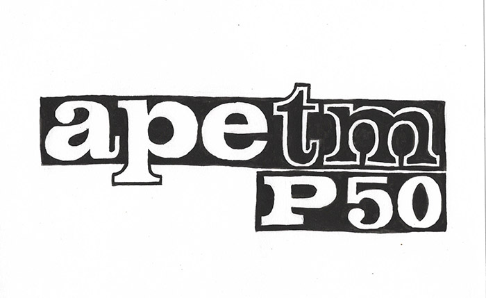
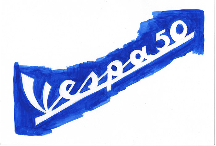
for spring vacation, we were on the island of stromboli where there are no cars, only vespas and the tiny three-wheeled trucks, apes (bees). they did sound like bees trundling down the tiny streets at top speed (20mph?).
another backwards sign. i wonder how the store owners decided what direction the correct reading should face?
from a shop in Venice
a fragment of text from a wall in Pompeii
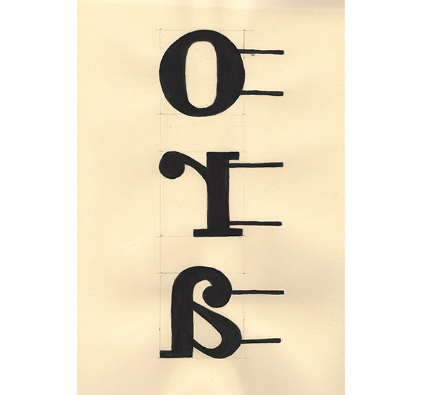
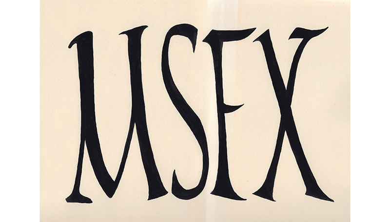
four letters found on a wall in Ostia Antica
sign found in naples. the sun was so strong, it created a shadow darker than the sign itself.
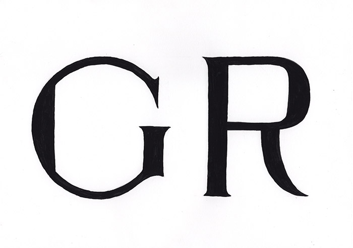
letters from building signage in the EUR: Palazzo Dei Congressi. i copied just two letters as i wanted to draw them large. does it matter that they were made by fascists? can you detect a lingering sense of totalitarianism in the forms?