
my first attempt was to copy Josef Müller-Brockmann.

and I realized I was pretty far off. this poster and the one below are the closest i could find to my "copy."
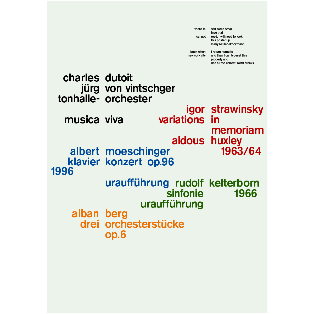
these are copies that i made from jpgs found on-line. the process of exact copying was interesting itself. i think his work is so beautiful, but in the act of copying, my mind is allowed to wander -- what does an old dead designer have to do with design today?

trying to draw from memory is actually really hard. a few embarrassing things: i completely forgot the bite taken out of the apple... when i finally looked at the logo, i quickly drew it in. i wasn't going to tell anyone... also, the serif on the L is backwards (!) -- but then it makes it look more like a stem, so maybe Apple should consider that change themselves.

again, I was way off here and this is more of an amalgamation of a few book covers from a series.

here is a copy of the real cover by Peter Mendelsund. It is not quite right as the Kafka should be knock out, but that is too hard in colored pencil!

and another by Peter Mendelsund. as you can see, my faulty memory did a combination of the two. Peter is actually a friend of a friend so i should contact him soon and ask him how he feels about being copied.

i just wanted to put this in here as i'm guessing Paul Rand's eye had a bit of influence on Peter's work.


