above is the original jpg/poster for a talk with a researcher/hacker living in Singapore. the version of the poster I got in my in-box was actually animated -- but this was a little to hard to copy, so i worked from the flat version. apologies to the designer, i couldn't find a credit -- please let me know if you know.

above is my version. my goal here was not an exact replica, but to copy the process of arranging the images and try to be more exacting with the type. it was interesting to try to be precise about something that looked so loose in the making. i think in choosing this i was intrigued by the idea of making something so difficult to copy -- and so different from my own style.

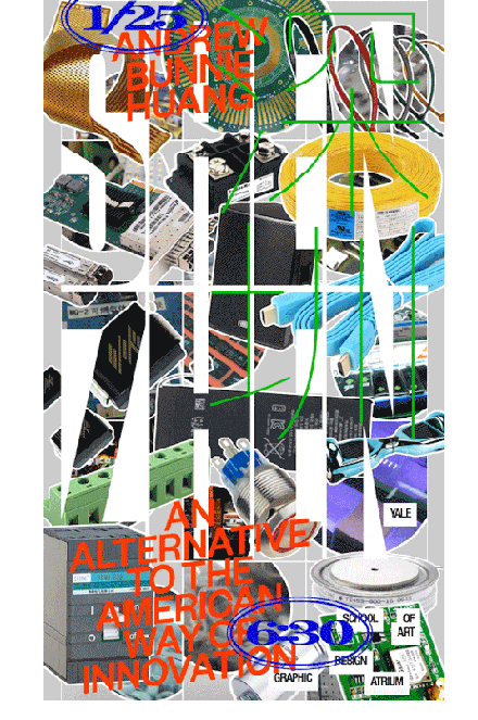
i'm not sure i used the exact right version of Helvetica -- my R is slightly different -- and the printer marks did not seem to be standard here. i think i chose this to copy because it is appealing and familiar -- it was reassuring to follow along. i found it on the yale design blog where it didn't have a credit. again. sorry.

there are a couple of things to note about this one -- first, it isn't exactly from the Yale design blog. i found another poster on the blog and followed it back to what I assume is the designer's tumblr page: franziskavirgili.tumblr.com. again, i don't think i have the fonts quite right here, and i'm not sure i used the same technique for making the 3D 'rope.' it was fun to try to figure out how to make though. the poster reminds me a bit of the work that our employee (a recent Yale grad), was making -- not in a bad way though. when everyone is sharing a common studio space and talking about ideas, there is bound to be some overlap -- from playful type treatments to new ways to use and abuse illustrator. i kind of miss being in school...

above is a poster by Moonsick Gang who graduated in 2016. the poster is also featured on the Its Nice That website. to keep things lively for myself, i copied this three different ways: recreating it digitally in illustrator, merely auto tracing it in illustrator, and then finally drawing it with paint and pencil. and the results...? i feel the most connected in the recreated illustrator version -- it is the closest I'm guessing to Moonsick's process. auto trace leaves no room for me to involve myself, and hand drawing seems antiquated and unrelated, although the auto trace version does seem to capture the decayed and machine-made aesthetic of the original.


