i’m sitting in the studio thinking about what makes us copy each other and where we can hope to find originality. if we are inseparable from our cultural context, often oblivious to our own influences, and expected to be working within the boundaries of client expectations, perhaps the only way to true originality is through our limitations, failures, and misconceptions. that sounds super pessimistic, but i don’t mean it to be. clearly the ideal design project is one where the content, client, and designer work together to find a unique solution -- something that is particular to the situation, exploring new visuals, yet still legible to the audience. because of this, sometimes it is the more unusual challenges that give rise to more original solutions.


above is an inscription that i found in the church of San Carlino by Francesco Borromini. the inscription was tucked away in a small room off of the sacristy. being far from a latin scholar, my eyes immediately were drawn to the number/letter combination, 16ss, and how wonderfully quirky and unusual it is. i’m guessing it is a creative solution to writing the 1600’s or a way to fit text that is running too long. regardless of the reasons, the result is beautiful and surprising.

above is a sign from a bakery nearby to where we are staying in rome. is this a specific font or did someone merely cut down the sides of the letters to fit the narrow doorway?

seeing these images side-by-side really highlights how badly i drew the letter spacing on the copy. which brings up the issue of mistakes. especially here in rome, looking at narrative religious painting, stone carvings and illuminated manuscripts where knowledge was circulated and passed down through copying, i’ve been wondering about mistakes or misinterpretations getting introduced into the flow. they must have happened. like mutant genes, have new stories and modes been introduced through slips of the hand and creative copying? in contemporary practice, if a copy misinterprets the original is it still plagiarism? when images of design are widely distributed and often disconnected from their original context, they become pure form and as such open themselves up to reinterpretation and reuse. is there anything fundamentally wrong with this -- aside from the potential embarrassment of the copier in a misinterpretation or misuse of someone else’s design?
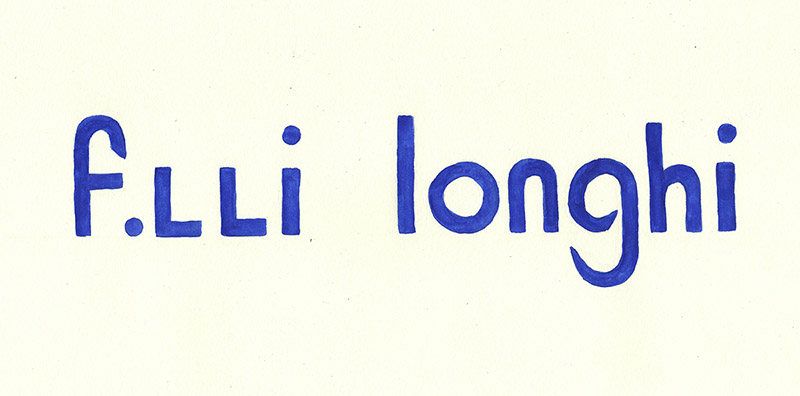
above is another store logo copied from an alimentary down the hill in trastevere. obviously, you can see in the signs i’ve chosen to copy in the vernacular section of this website, that i have a soft spot for funky, hand made, badly kerned, or ridiculously squashed typography. not to advocate that all design should be weird (note to clients, i make nice design as well...), i just am thinking as i work through this project that as designers in the face of powerful, pervasive conformity, we need to look to the edges and the cracks and accept our own differences. i recently read this quote from a designer, Ka-Man Tse, on the AIGA design blog “So many people have impostor syndrome. You have to unlearn it. In the arts, asking questions is a good thing -- not a vulnerability. i believe in radical vulnerability.” i wonder if there is a way that this project on copying could be seen as a radically vulnerable practice in itself.