it’s all fun and games until there is real money at stake. i think it is easy to say that copying doesn’t matter these days and as contemporary makers, we are all a just bundle of influences anyway but that is not exactly fair to innovators and experimenters. the challenge is defining the limits. to start, it is interesting to look at current copyright laws which are trying to grapple with this. it’s not surprising that copyright laws originated around the time of movable type. but what about today when collaging and sampling are so prevalent? is it possible to copyright a style or process?

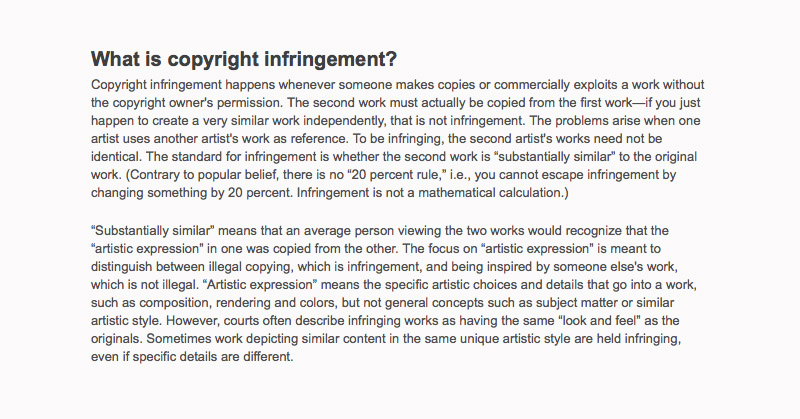
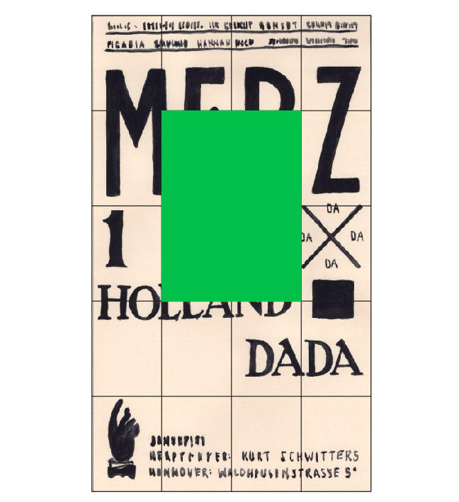
i wonder if my copies here would be illegal? the bit of text above is from an article on the AIGA website -- ‘Copyright Basics for Graphic Designers,’ by Linda Kattwinkel, July 01, 2007 -- please see the link at the side for the full article. what i find interesting is the so called ‘popular belief of the 20 percent rule.’ i never heard of a 20 percent rule, but wow, that would be kinda cool. i imagine getting out my ruler to measure a piece of design to figure out if 20 percent was changed -- i actually went so far as to make some pieces based on this faulty belief (see one below). a concrete number like 20 percent would be easier in some ways than trying to figure out if something is ‘substantially similar’ or what the ‘artistic expression’ might be that can be owned. so it seems that you really can own a style or process but the determinations are incredibly hazy.


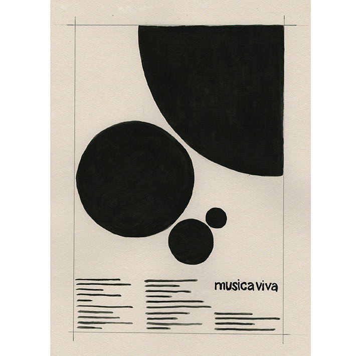
i think things might have been easier when there were clearer schools of thought for design. swiss graphic design, also know as the international style, began in switzerland post WWII, and was the dominant design style for many years. like the copy of Josef Mulller-Brockman’s musica viva poster above, the style was characterized by its very specific use of a grid, limited type options, and articulated sense of balance and scale. it was founded on the premise that there was a definitive and universal correct way for information to be presented. books like Muller-Brockman’s ‘Grid Systems,’ Emil Ruder’s ‘Typography,’ and Armin Hofmann’s ‘Graphic Design Manual’ were widely dispersed and set the standards for graphic design. it was very restraining, but gave designers guidelines to follow. and so for a time, design all looked pretty similar, but that was kind of the point -- everyone was playing by the rules.

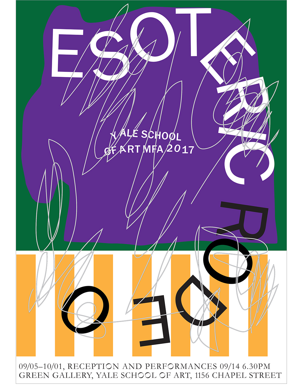
today, we’re still following rules, but there is more emphasis on creating something new and establishing your own style like the copy of Franziska Virgili’s poster above. the rules are more like a loose boundary line surrounding contemporary aesthetics. and of course context is everything: a poster for an exhibition at an art school has a completely different set of expectations than packaging for a major department store. i think where things get uncomfortable are when there are designers working more independently and creatively for less money on the fringes -- who are inspiring designers who are working for more money for bigger more commercial clients. where we work, where live, how we think about design is something we individually decide as designers. but when influence from the edges veers into copying in the mainstream, problems arise.

another issue with value and ownership is fame. Michelangelo’s David only gets more famous and valuable the more mini copies that are made -- and the aprons, coffee mugs and trinkets that are sold with an image of the David on them. for designers, the more popular you become, the more work you make and the more distributed it gets. the more a style of work becomes universal, the less it seems particular to a specific artist and the more open it becomes for copying. when a style is too common and imitated, it starts to lose value. since starting this project, i have noticed several recent stories on Its Nice That where designers mention how the popularity of their work has forced them to change what they do in the face of all the copying.

fame and popularity can now be quantified through social media. clients and designers know immediately how popular a design is through the number of likes and links. but is popular necessarily successful or good? are we getting funneled into all making similar work? Walter Benjamin presciently wrote,
“The freeing of an object from its sheath, the shattering of the aura, is the mark of a perception whose 'capacity to appropriate what is similar in the world' has increased to such a degree that it also appropriates what is unique through reproduction. The manifestation thus occurs in a perceivable data of what is demonstrated at a theoretical level by the growing importance of statistics: the orientation of reality towards the masses and of the masses towards reality is a process of unlimited scope for both thought and experience.” -- from “The Work of Art in the Age of Mechanical Reproduction,” translation by Salvatore Settis. through appropriation and reproduction, concepts of unique and real are getting blurred. someday computers will take over my job.

the act of “appropriating something unique through reproduction” is something that goes on all the time with handwriting fonts. you see these used when some piece of design wants to look personal and casual -- just like a pair of pre-ripped jeans. when someone has really good handwriting, the letters are quirky and playful yet balanced and even -- there is a satisfying similarity of forms between the letters yet no two are the same. when designers use a font that emulates handwriting, all the letters are exactly the same. a unique ‘i’ gets copied precisely when repeated three times in ‘individual.’ below is an example of a project i did where i copied a digitized handwriting font -- the personal filtered through the computer back to the personal. the phase ‘hello world’ is a traditional message created in testing of computer programs. i think this is a good place to end for now.


